Sweaters. Warm, cozy, and sometimes scratchy and ill-fitting if your great-aunt made it. (Your mother will force you to wear it when she comes over.)
They remind us of sitting by the fire with loved ones and the winter months.
But not these sweaters.
No, these are for the hard-checking and dashing gentlemen who grace the National Hockey League.
With the novel coronavirus putting the end of the NHL season and playoffs on hold (the Minnesota Wild would have lifted the Stanley Cup, by the way), what better time to reflect on a part of the game that makes it territorial yet beautiful all at once?
You may see some similarities between how I rank them, but again, this is an opinionated ranking. Right?
Here is my biased ranking of each NHL home sweater from the 2019-20 season.
31. Anaheim Ducks
I love orange, when it is used correctly as you’ll notice later, but I have no idea what the Ducks were thinking when they released these.
From the basic striping to the logo that is a total miss from the old and amazing Anaheim Mighty Ducks days, it lacks any sense of artistic value and looks like it comes straight from the generic jerseys on NHL 20. Next.
30. St. Louis Blues
Singing “Gloria” and hoping they go from the bottom of the West to Stanley Cup champions again won’t push the Blues forward on this list. While the logo is simple and elegant, the usage of black on the dark blue does not allow the logo to pop. The dark blue on the shoulders should be replaced with the yellow accent to allow for a more appealing visual.
29. Arizona Coyotes
While the Coyotes’ logo is fine, to put it nicely, it is nowhere as whacky and retro as the ‘Peyote Coyote’ look from they used in the late 90s and early 2000s that paid homage to the Native American art and culture in the region.
This lends to the jersey being underwhelming with a lack of any distinctive flair besides their shoulder patch.
28. Dallas Stars
Now this may be the Minnesota in me talking, but the Stars would be at the bottom of this list if the other jerseys were not more abysmal.
From Norm Green’s promiscuous theft of the North Stars to Dallas to the Cups won right after the move, these sweaters look nice but do not stand out as much as the bright green and yellow the North Stars held onto until the relocation and bring back too many painful memories of a decade without professional hockey for my family and friends.
27. Ottawa Senators
With a rebrand rumored to be around the corner for the coming season, if there is one, the Sens could see themselves catapult up this list. But for now, it is confusing to figure out what is going on. The honoring of their old logo with the “O” as their should patch is a nice touch, but the lack of any other interesting visuals led them to the bottom third of the rankings.
26. Florida Panthers
I’ll admit it, I was skeptical when it was announced that Adidas was becoming the league’s jersey partner starting in 2017-18, but the mid-chest stripe that they implemented has grown on me.
I like the color scheme the Panthers have to play with. But they don’t play with it in the slightest. Instead, a shield logo, which should be left in soccer, has made its way into the NHL while the panther donning the crest looks stoic yet disinterested. It makes sense given how they’ve played in recent years.
25. New Jersey Devils
The logo is iconic and smartly designed with the “NJ” for New Jersey making up the devil. But a simple black shoulder stripe and empty bottom third of the jersey leaves a lot to be desired. Maybe their on-ice performance will make up for it.
24. Philadelphia Flyers
As mentioned, I like orange. While the Ducks completely whiffed, this is only slightly better. Their logo makes sense for Philly but keeping with a traditional look since inception does not always fly. Get it? (rimshot)
23. Montreal Canadiens
Believe it or not, the “H” in the center of the Canadiens logo does not stand for Habs. I know, I needed to see a therapist too after learning that.
It actually stands for the club’s full name, Club de Hockey Canadien. A fitting logo for a team that habitually under underperforms. Outside of the logo, the jersey has remained relatively unchanged over the years which is nice to see out of an Original Six team.
22. San Jose Sharks
While teal is a suiting color for a team with a shark as their mascot, the lack of any additional and unique markings place them this low in the rankings. An alternate logo on the shoulders or a shoulder stripe would be a much-welcomed touch.
21. Washington Capitals
Patriotism is all over the board nowadays, but the Capitals embrace being based in the nation’s capital. Their alternate logo has some sneaky Easter eggs with the “W” for Washington D.C. and the Capitol Building hidden as the eagle’s head, but their primary logo is too busy and lacks any marks relating itself to their place of actual residence.
20. Columbus Blue Jackets
The fact they have a cannon that goes off after every goal at home is bomb and their dark blue and patriotic coloring is fitting for a state with immense pride and a unique flag to boot. But what happens if Cincinnati or Cleveland get a franchise in the future? Who gets the flag? Will we have an Ohio civil war on our hands? I need answers!
19. Carolina Hurricanes
With a lack of any shoulder striping or alternate coloring, it is hard for the Hurricanes to stand out. Add in the strange hurricane design and it is not going to psych out your opponents. The one redeeming factor is the warning flag on the waist. It provides decent texture and is why the Canes did not drop lower. What a bunch of jerks.
18. Boston Bruins
Sorry, Boston. You can’t be at the top of every mountain. Might as well get used to it now that Brady is gone.
While the Bruins could be claimed as the epitome of success, their lack of change with regard to their home sweaters is one of the few times a franchise as historic as Boston doesn’t work.
17. Pittsburgh Penguins
This is where it gets tricky. The next six to seven could be in any order. While not the best or worst in the league, the Pens have a solid and historical logo that can’t be matched within the league for its originality.
16. Los Angeles Kings
I absolutely adore the clean white on black that the Kings have. That may be a hot take due to how beautiful the royal purple sweaters were, but if they were to go back to them the Kings would shoot up this list.
15. Calgary Flames
For a team that kept its namesake after relocating, I am surprising I placed them this high up. The yellow, red, and black complement each other well but the drawback is the sleeves.
Too many things are vying for attention, like all the bills and student loans I can’t pay due to a horrific job market, and a simpler look may be enough to bump them up.
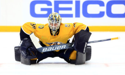
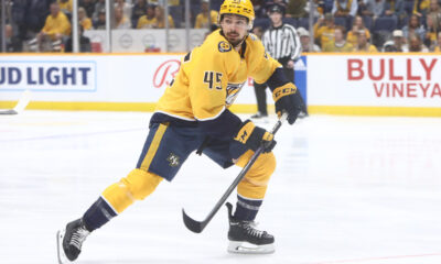
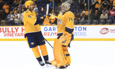
14. Nashville Predators
Good thing I haven’t shared my address with any of you…
While you don’t often see yellow (Editor’s note so Sean Henry doesn’t get mad at us: gold) as a primary color for a team, the Preds have found a balance in its simplicity and the fans have devoured it. Their recent success hasn’t hurt their ranking and adding some nice accents to the jersey would be beneficial.
13. Buffalo Sabres
Sabres, an old school buffalo design, and a very naval blue and yellow combo makes this one stick out over the ones before it. Elegance and a beautiful simplicity will almost always play in one’s favor with me.
12. Colorado Avalanche
It is hard to relocate a team and find similar success and loyalty that the Avs have cultivated since coming down from Quebec.
With a color scheme that is not anywhere else in the league and the Rocky Mountain-esque design on the waist alongside their distinctive logo, the Avs nailed it with their branding.
11. Vancouver Canucks
Some knock the Canucks’ jersey and logo due to a Canuck being a Canadian yet the logo being an Orca. But this is my rankings, so they receive a decent spot on the list due to the very Pacific Northwest theme and coloring with the blue and evergreen. Who even cares what a Canuck is?
10. Tampa Bay Lightning
Sleek and simple, the Bolts and their rabid fans have completely bought into the crisp blue and white contrast that highlights not only the team’s location as the lightning capital of the world, but their proximity to the Gulf of Mexico and the beautiful waters that lay there as well.
9. Toronto Maple Leafs
The Leafs may have crept higher up on the list if the upcoming teams did not have as beautiful uniforms as they do. However, the leaf design is synonymous with Canada and the Leafs could be debated as Canada’s team and everything from the logo to the sweater scream that. Think of them as the Cowboys in the NFL: used to be extremely successful, with iconic imagery at their disposal, but they cannot seem to pull it together as of late. Nevertheless, this one belongs in the top ten.
8. New York Rangers
I may need to go into the Witness Protection Program due to dropping this classic to eight, but that does not mean it is a bad sweater by any means. The only team to utilize the diagonal lettering and the iconic red, white, and blue make this a hockey staple that has clearly stood the test of time.
7. Edmonton Oilers
While not my favorite orange (see below), it is common sense why it is utilized here with the oil drilling history in the area and the logo fits the bill. The dark blue in tandem with the orange provides a depth to the jersey allowing for each color to stand out while also working in harmony.
Too bad it’s being wasted on McDavid.
6. New York Islanders
This is how you do orange! Pair it with a beautiful blue and have a logo that isn’t overly busy while highlighting the team’s location and history by allowing the “I” in Islander to almost perfectly line up where Nassau is.
5. Winnipeg Jets
While arguably my team’s biggest rival, I must give credit to a team that was born from the ashes less than a decade ago to rank this highly. With an aviation theme that includes both clean likes and coloring along with the nod to Canada through the red maple leaf accent, it fits for a club in a city as small as Winnipeg.
4. Minnesota Wild
Is it biased for a Minnesotan to put the Minnesota team this high up? Asking for a friend.
The evergreen and tan fit not only the team’s sweater and logo, but the state as well.
It is the State of Hockey, after all.
They also pay homage to the North Stars who were stolen from the state by Norm ‘Greed’ by incorporating the North Star in the logo’s eye. It’s a nearly complete package that summarizes what Minnesotans love most.
3. Detroit Red Wings
Their on-ice performance leaves a lot to be desired. Especially for as storied a franchise as they are, but the all red with simple white striping on the arms and waist is as clean as a jersey can get. Pair it with the beautifully fitting logo for the city and it’s a top-tier contender.
2. Vegas Golden Knights
Is it black? Off black? Charcoal? I did not look up how the Knights classify it, but it is VERY Vegas.
With red and gold accents, this one has grown on me as quickly as a bachelorette becomes attached to the Bachelor. Throw in their first-year success and the sharp, clean lines on their logo and you have the making of a long-standing classic.
1. Chicago Blackhawks
I despise the Blackhawks. They are practically everything the Wild aren’t outside of passionate and loyal fans. But I’ll give them credit, their sweaters are, well…I’ll let Lady Gaga explain it.
From the bright and intimidating red to the feather coloring and their alternate logo on the shoulder, it is the epitome of what a perfect NHL home sweater should be. The fact that they are an Original Six and have retained this look makes it even more impressive.
So what are your thoughts, hockey fans? Especially with PBR being based in Nashville, I’m sure many of you will disagree, so let’s hear it!


